Basement Home Office Redo

Designing a home office is always a fun challenge. It’s one space where everything needs to be functional and look good and to top it off, it tends to be in an odd space. This basement home office is no different. With a weekend’s worth of work, this home office can be completely transformed into a function and beautiful space.

There are several parts of this room that we are not going to change because they work well in the space. The room is a nice open rectangular plan which we are going to keep since the basement isn’t used for anything else. The window, albeit small, allows natural light into the room which is fairly rare in a basement so we are going to leave it open like it is. Finally, the recessed lighting fixtures are also nice in a basement because they provide good general lighting without making the ceiling feel like it is lower which is important in a basement. All these qualities help make the room feel more like a home office and less like a basement.

The first change needs to be the color temperature of the room. This room is oddly yellow-orange. To fix the coloring, paint the walls a high contrast or pure white which will cut down on the warmth of the walls. Then replace the recessed bulbs with a higher temperature LED light in Daylight or maybe Cool White which will have a more neutral tone than the lights currently used. Your energy bill will also thank you for switching to LED due to the increased efficiency. Then under the soffit hang a large piece of art that has cool and neutral tones that will also cover the electrical panel since no one wants to look at that. These changes will help cut down on the warm coloring of the room.

The next problem with the room is, the workspace lacks definition. Simply add a large area rug in the middle of the room in front of the large piece of art. This change will define the space as the home office and anchor the workspace instead of just having a desk floating in space in the room.

Then, the office is lacking beautiful functional storage. On the wall with the window take upper kitchen cabinets in a Shaker Style and place them on a simple 2×4 base. On top of the cabinets add a large simple 3×3 cube out of plywood that fits the space. This will provide closed storage and open display storage for the office. This change will allow books, certificates, and personality items to be displayed while keeping paper and supplies hidden. Then put the filing cabinet in the closet because it throws off the balance by being overly heavy and a mid height. That change will increase the storage and create a focal wall for the room.

Next, the workspace lacks the scale and visual impact it needs to have. To correct this, take the current desk and place it on the area rug with its length mirroring the length of the room. Then, add a smaller desk in a similar style perpendicular to that desk so it forms an “L”. On the new desk place the printer and add an All-in-one computer like the iMac which will create a defined computer work zone and make the printer feel less heavy in the space. Finally add two wooden swivel chairs for guests to the office and add a wood and leather office chair behind the desk which will create a more cohesive style for the room. These changes will give the workspace the visual impact it needs and create a more functional workspace.

Finally, the office needs better task lighting. On the computer desk place the current desk lamp. On the other desk where the paper organizer and a desk calendar will be, add a vintage-inspired library light which will create better task lighting for that work zone. Then add LED puck lighting to the shelves and above the piece of art, which will create dedicated display spotlights there and create a more upscale look for relatively inexpensive.

With only a weekend’s worth of work, this basement home office can be completely transformed from a drab and boring space into something that is beautiful and functional. Using simple, non-permanent changes the space is now usable and beautiful.

Tune Up Time: Kitchen/Dining Makeover

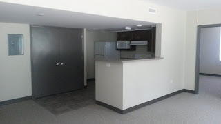
The kitchen in most homes is the most important room. Not only does the room have to be functional, but it also needs to look good. While this typical rental kitchen has some elements I do like, for example the dark wood cabinets, there are several elements that I do not like that need to be either dressed up or changed.


Most rentals do not have nice wooden cabinets, this rental however has fairly nice looking dark wood cabinets that should stay. Wood cabinets don’t work in all spaces, but in this space add a much needed organic element, especially when contrasted with the brushed nickel hardware. They are also a simple enough shaker style that they can go with most styles which makes them versatile in their current form. My verdict is to leave them alone.

The first change this spaces needs is a fresh coat of paint that is not institutional off white. These walls are a beige-y warm off white. A neutral high contrast white will look much better for the space by not only brightening it up, but the paint color will also provide a better contrast with the cabinets. In the actual kitchen part, a semi-gloss paint will also hide the recessed lights in the ceiling and switch plates better while providing an easier to clean finish. In the rest of the room (and apartment) either a satin or eggshell finish would be better since they will brighten the space but not overpower; as well, glossy paints are only necessary in areas where durability and the ability to regularly clean are desired, otherwise a less expensive satin or eggshell is fine.


A pro tip for good design, is to paint the switch plates and registers when a room is painted. In the first picture every outlet, light switch, and heating register is clearly visible, even in the background of the image. This effect is not desired. While these objects are required to have a functioning house, by painting over they will blend into the wall and become unnoticeable unless the viewer is up close. It is worth it in a rental to just spend the money to replace the switch plates when you move out if simply painting over them white doesn’t return them to a desired color (and usually painting them white will suffice). This tip is the difference between good design and great design.


The next part of the room that stands out is the institutional metal double doors and electrical panel. Behind the double doors is the washer and dryer so they can’t just be covered with shelves or artwork that isn’t easy to move; instead, hang either a large tapestry or several curtain panels to cover the ugly elements and act as a feature wall. By using something that can easily be moved out of the way the washer and dryer can still be used on a regular basis and the electrical panel is easily accessible in the event that a breaker is tripped, but you won’t have to look at any of the design faux pas. IKEA has relatively inexpensive options for wire or track options for hanging the panels or tapestry. Conversely, you could also DIY a wire using off the shelf parts from a home center if you desire full control over the solution.


In front of the long half wall, a sofa table or some other type of long thin tall table would work well in the space and not overpower the room. Something like a Parsons Table or a table with hairpin or taper legs will add visual interest to the space. Then on top of the table, style with circular elements like using pillar candles on a circular serving platter or plate and using a circular bowl as a drop zone to counteract all the harsh angles of the half wall. Then add a plant to the table in a circular pot to not only add an organic feel to the space (which will help the place feel homier and less institutional), but also add another circular element. Just remember to style it in threes or a similar magic “design number.”


On the large swath of wall next to the opening would be a great place to hang a mirror. The mirror should be large and extend almost all the way from the top of the table to the ceiling. This mirror will do two things then: first it will make the space feel bigger by not only reflecting part of the room and light, but it will also draw the eye up by extending so far up on the wall; secondly the mirror will minimize the visual impact of the soffit by drawing the eye toward a different element of the design, i.e. the mirror.


Above the table, would be a good place to hang a plug in pendent light which would add nice general lighting to the space and help further define the area around the table. The addition of this light will also get us to the magic design number of three which is a good balance for design work. To increase the design level further, hide the cord for the light behind mirror and table and use a wireless switch like Phillips Hue or Lutron Caséta to turn the light on an off. This design choice will make the pendent seem like it is permanently installed without requiring an electrician to be called.


While on the topic of lighting, the institutional fluorescent light fixture in the kitchen needs to have a diffuser either built or bought to cover it. It looks like it belongs in a utilitarian office, and will stand out in a bad way no matter how well the rest of the space is designed.


In front of the short half wall would be a good place to add a small kitchen cart which could act as storage for dining essentials or as a bar. This element will help define the small transitional area as a dining room and better utilize the space. It will also create functional decor, which is taking something that is used or consumed and treating it like a decoration. Place the alcohol on a circular mirrored serving platter to further counteract the harsh angles of the half wall, or use a circular cart, but those can be expensive and hard to find. On the lower shelf of the cart, would be a good place to house overflow storage in decorative storage boxes to further counteract the harsh angles.

To completely define the space as a dining area, a large rectangular rug that will completely cover the odd transition between ugly office carpet and ugly vinyl tile would be necessary to fully define the space and remove the odd breakup of the room. Then on top of that rug, place a circular rug in something like grey or jute to define the area where the table will go and create open defined traffic flow patterns for the space. These rugs fully defines the area as a dining room.


On top of the circular rug, should then be a circular table. A table with a design language similar to the Saarinen Table would be perfect space the space, especially if it is accompanied with similar chairs in either colored or clear acrylic. While Knoll (the company that makes the real Saarinen) charges thousands of dollars for even a smaller version of the table, IKEA sells a 41” table that looks almost the same for under $200. If you want the marble top that some versions of the Saarinen Table have, a roll of marble contact paper can achieve the desired look on a budget and no one will be the wiser, well unless they have to move it.


Finally above the table would be a perfect place to use one of the recessed light to pendent kits to provide better dining task lighting. While this is not pictured, it will put the final touch on the space and make the dining room brighter and create a better dining experience, especially if the fixture is paired with something like Phillips Hue or Lutron Caséta which allows an infinite number of options for controlling the lights to create the perfect ambiance.


This space is now more cohesive and better designed than when I started with it, and some of the more questionable elements have been either changed or hidden which increases the design level of the space dramatically. At the end of the day, the space is homier and more comfortable to spend time in.